Vectoring a Pair of Luscious Lips in Illustrator CS6 from Stock

Last month I showed you how I create detailed, stylized eyes from a stock image. This time around, I'm going to show you how I create a pair of detailed luscious lips from a stock image, including the teeth.

Introduction

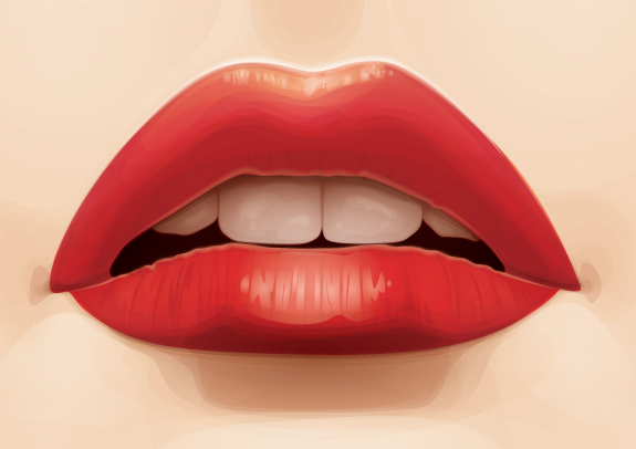
The exact steps and colors I use differs from project to project, so this is just what I've done for this specific stock image. However, this being said, the process remains the same on how I achieve certain elements of the lips detailing.
The stock image I'm going to be using you can get over on Photodune. I've picked this one specifically so you can see how I've rendered the teeth.

Step 1

I'm just going to prepare my file ready for vectoring the lips. In the first layer I'm going to rename it "Reference" by clicking in the text area of the Layers panel, which is a new feature of CS6. You no longer need to Double-click on the layer to rename a layer in the dialogue box and click on OK. I've went to File > Place the reference image into that first layer and then locked it.
Now Create New Layer and rename it BG. Within this I put a white fill, with Opacity 50%, Rectangle (M) across the reference image and then locked it. Then added two additional layers and renamed them "Skin Shading" and "Lips".
I tend to take advantage of the swatch libraries within Adobe Illustrator. One of my favorite are the "Skintones" swatches, which you can find by going into the drill down menu and going to Open Swatch Library > Skintones. If you click on the folder at the left of the swatches it will add them to your Swatch panel.

Step 2

Time to begin vectoring the lips. I view a lot of vector portraits online and one of my biggest pet hates in seeing detailed portraits are lips which appear to be floating independently on top of the skin. Lips are skin and should be shaded as such to prevent them from looking like they are floating. My biggest tip is to incorporate your lip shading into the skin shading and then use Blending Modes to tint and add detail to the skin.
I'm starting the skin shading with a base of the medium skin tone (C=0, M=15, Y=25, K=5) and then using a slightly darker shade (C=0, M=21, Y=35, K=7) to fill shapes drawn with the Pen Tool (P) around the lips and setting them to Blending Mode Multiply, with Opacity 7%. The shapes drawn should include the slight shadow at the corners of the mouth, the dint below the nose tip and underneath the bottom lip.

Step 3

I'm going to build up the shadows now with a slightly darker fill color (C=0, M=25, Y=30, K=10), then set to Blending Mode Multiply, with Opacity 7%. It's worth noting for each color I add, then Group all of the shapes (Command + G), to make it easier to go back and alter should it be necessary.
After adding very basic shading, I start to render the lips as two shapes/elements rather than one large shape. It's completely fine for the shapes to overlap, especially at the corners of the mouth, as this is where the lips will typically be darker. Pay attention to where the light is on the stock image if you're tracing it. From this stock image, the light is coming from above, therefore this should be reflected in your shading.
Even with the slight shapes we're building up, you can see the shading starting to form the lips.

Step 4

Now to focus more on the lips. I'm going to use a rose tint skin shade (C=11, M=46, Y=37, K=9) set to Blending Mode Multiply, with Opacity 10%, and add shapes to enhance the shape of the lips and the shadow on the lower portion of the shapes.
As you can see from the image below, the parting of the lips isn't so tidy. This doesn't matter right now as long as the rest of the lips are more smoothly rendered. The center of the lips/inside the mouth will have a shape overlapping this area and hiding the messy shape edges.

Step 5

I'm going to add highlights on and around the lips using transparent radial gradients with a light skintone (C=0, M=9, Y=15, K=3). These shapes will be set to Blending Mode Screen with Opacity 20%.

Step 6

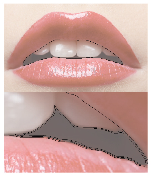
The inside of the mouth will have it's own Layer as I'll want to add elements below it (the lip shading and skin shading) and above it (the teeth). So Create a New Layer and rename it "Inside Mouth".
I'm going to draw an overall shape for the inside of the mouth and then slightly smaller shapes within, around the teeth. These will have a dark brown fill, which can be found from the Skintones swatches I added at the beginning (C=30, M=48, Y=50, K=66), then set to Blending Mode Multiply with Opacity 60%.

Step 7

Using the Appearance panel I'm going to add four fills which contain the same dark rose (C=11, M=46, Y=37, K=9) transparent radial gradient. Use the Gradient Tool (G) for each fill to move and shape the gradient so there is one for the bottom of the lip, mouth parting and corners of the mouth. Each of these fills are set to Blending Mode Color Burn with Opacity 100%.
I then added a magenta fill and a green fill over the top of the gradients with the below Blending Modes and Opacities. Place this shape underneath your initial lip shading.

Step 8

Now to add dark rose shapes (C=11, M=46, Y=37, K=9) which add creases to the lips as well as shadow underneath both of the lips. Again while adding the shapes, you're adding shading beyond the lip region so you're including the face skin shading into the lip shading. All the shapes drawn are with the Pen Tool (P) and have a Blending Mode of Multiply with Opacity 20%.

Step 9

Create a New Layer and rename it "Teeth". This layer will need to be on top of the "Inside Mouth" layer. I'm going to draw around the shape of all four of the visible teeth. Then duplicate the shape for the inner mouth area and use it to Pathfinder > Intersect. This will result in an exact fitting over all teeth shapes for the mouth and it will trim off any edges which overlap onto the lips themselves.
A key thing to remember is that when you're doing detailed teeth that are stylized towards a realistic look, teeth aren't white! I'm going to then fill it with the highlighting transparent radial gradient, which I used for the skin highlighting in the previous steps. Then change the Blending Mode to Screen with Opacity 30%.

Step 10

I'm going to use the same transparent radial gradient to fill shapes for each of the teeth. These are going to be set to Blending Mode Screen with Opacity 20%. If you notice the placement of the gradients, they are positioned towards the bottom of the tooth. This is because of the slight shadow cast from the lips.
I'll continue working on each tooth, building up on each tooth individually. Then I'm going to add a slight texture to the teeth using the same gradient, yet set to Blending Mode Screen with Opacity 10%. When using more irregular shapes with gradients, a lower opacity is best used to avoid seeing any hard edges from the gradient being cut into.
Finally, a duplicate of the original teeth shape is laid over the top of the tooth shapes with the same fill and is set to Blending Mode Color Dodge with Opacity 40%.

Step 11

Using another duplicate of the inner mouth shape, I'm going to fill it with a dark brown/red, inverted, transparent radial gradient (C=0, M=75, Y=100, K=85) and set it to Blending Mode Multiply with Opacity 40%. With the Gradient Tool (G) I'm going to position and shape it so the gradient acts like a shadow cast over the top of the teeth.

Step 12

Now to add a shine to the lips. Create a New Layer, rename it "Shine", and place it underneath "Inside Mouth".
I'm first going to use a pale rose, transparent, radial gradient (C=5, M=20, Y=15, K=1) set to Blending Mode Screen with Opacity 50% shines and highlights to the lips.

Step 13

Now I use the great feature of gradient on stroke from CS6 to add lines along the top of the upper and bottom lip, and along the bottom of the top lip. I created a gradient using the same pale rose as the highlighting gradient, yet this time within a linear gradient. I used the below Stroke panel settings and set the strokes to Blending Mode Screen, and from top to bottom Opacities: 80%, 20%, 40%.

Step 14

In theory, the two front teeth are more exposed to light. Therefore, I'm going to use the dark brown/red, transparent radial gradient (C=0, M=75, Y=100, K=85) to add shadows cast onto the side teeth, corners of the mouth, and under the bottom lip. These shapes will be set to Blending Mode Multiply with Opacity 20%. So it's a subtle change in shadow.
Advertisement

Step 15

Finally, I'm going to duplicate the complex Appearance panel lip shape and lay it over the top of all your lip shading (excluding the shine) and then change the magenta to red. With this additional shape it has helped increase the overall contrast of the lips.
This will leave you with your finished luscious lips!

Conclusion

I hope you've enjoyed today's tutorial. If you want to play around with colors of the lips and not affect the teeth and inside of the mouth, duplicate the complex Appearance shape and then Pathfinder > Minus Front the shape of the inside mouth. I've then dragged and dropped this shape into it's own layer above the "Lip" shading.
By playing with the fill color and the Blending Mode, you can come up with some funky colored lips to give your portraits some extra character... why not check out these variations.

Create a clean retro badge in Adobe Illustrator


In this tutorial we are going to create a clean retro-looking badge/burst in Adobe Illustrator. These are great for adding to a website, advertisement, etc to help the text stand out.

Step 1

First off we are going to open up a 1200x1200px document in Adobe Illustrator.
Type out “AWESOME TUTORIALS BY DENIS DESIGNS” in black for now. Change the font so “AWESOME” and “BY DENIS DESIGNS” is in Adelle, and “TUTORIALS” is in League Gothic. “AWESOME”, “TUTORIALS”, and “BY DENIS DESIGNS” should all be in separate text boxes.


Step 2

Change the font size of “TUTORIALS” to 250pt, “AWESOME” to 60pt, and “BY DENIS DESIGNS” to 35pt. We can always adjust these font sizes later on, but they will work for now.

Step 3

Now we are going to start adding some shapes to our burst. Using the Rectangle Tool (M), draw a box around “TUTORIALS” with a little space around the text. Change the background color to white, the stroke color to black, and move it behind the text with Ctrl+Shift+[

Step 4

Click on Type>Create Outlines, this will make our text into lines and points, which will be easier to deal with. To make sure that our text is lined up in the center of the box, click on the text and the box and go to Window>Align, to bring up the Align palette. Click on Horizontal Align Center and Vertical Align Center.

Step 5

Go to View, and make sure Smart Guides is checked. Now click on the box and drag a horizontal and vertical guide to the center, they should lock into place.
Select the Ellipse tool (L) and while holding Shift and Alt, make a circle starting at the center of the box. Change the color to black, with no stroke.
We also want to make a star/burst that will be a little wider than the circle. Click on the Star tool (under the same button as the Ellipse and Rectangle tool) and before you unclick, we want to make more points. Simply push the up button on your keyboard to add more points. Also to make the depth of the points more shallow, hold down Alt and make the bust smaller.

Step 6

We want to take the inner circle we made and shrink it down a little bit, while holding Shift and Alt. Change the color to none and the stroke to white. Make sure the star burst is behind everything with Ctrl+Shift+[.

Step 7

Take the circle, duplicate it with Copy and Past in Place (Ctrl+C, Ctrl+F). Shrink it down with Shift and Alt. Our text is going to go on this path, so click on the “AWESOME” text, copy and paste onto the path with the Type on a Path tool. Change the color to white. Go to Type>Type On A Path>Type On A Path Options and make sure Align to Path is Center.
Duplicate the “AWESOME” text and paste in “BY DENIS DESIGNS”. Now go to Type>Type On A Path>Type On A Path Options and click on Flip and make sure Align to Path is Center.
Hold Shift and rotate the “BY DENIS DESIGNS” text so it is on the bottom, change the color to white.

Step 8

We are going to turn our “TUTORIALS” box into a banner. Click on the box and duplicate it with Ctrl+C, Ctrl+F. Shrink it down horizontally so it overlaps the box a little bit. Hold down Shift and move the box down twice.
Click on the new box and using the Pen Tool click the center of the left side of the box. Hold Shift and move the point in twice.

Step 9

To connect the two boxes we are going to use the pen tool to make a triangle, something like what is below.

Step 10

Select the new box and triangle and group them with Ctrl+G. Move them to the back of everthing with Ctrl+Shift+[. Duplicate the grouped items, and go to Object>Transform>Reflect and bring it over to the other side.

Step 11

We want to soften the edge of our outer burst, so go to Effect>Stylize>Round Corners, and change it to 10px.

Step 12

Duplicate the white stroke circle, and make the new circle a little bit bigger. We are going to change the smaller circle to a dotted line. To do this click on the smaller circle and then go to Window>Stroke. Check Dashed Line option, change the weight to 5 pt, change the Dash to 0, the gap to 12 and check Round Cap.

Step 13

Next we are going to give a retro shadow to our banner, so we are going to start off by making a rectangle starting at the back part of the banner and going just past the edge of the top part. Using the Pen tool, add a point to the middle of the right side of the rectangle and delete the top and bottom points to make a triangle.

Step 14

Hold shift and rotate it 90 degrees so the point is facing up. Go to Window>Brushes, and click on New Brush. Click on New Brush Pattern and then OK. Change the Colorization Method to Hue Shift and click OK.

Step 15

Draw a line from the top to the bottom of the back part of the banner. Click on our new brush in the Brush Palette. Make sure the points are sticking out and using Ctrl+[ move the shadow behind the top part of the banner. Go to Object>Expand Appearance.
Duplicate the Shadow, flip it 180 degrees and move it to the other side of the banner.

Step 16

As some final touches we are going to add some star accents. Click on the start tool, and use the up and down arrows to make the star have five points. Shrink down the star and put one on each side of the original star. Duplicate those stars and move them to the bottom as well.
To make sure our stars are in the middle of the burst, select the entire burst/banner (except the starts) and group with Ctrl+G. Now click on all the stars and group them. Click on the burst/banner and the stars, then in your Align palette (Window>Align) click on Horizontal Align Center.

Step 17

We are now going to arc the banner. Select all the elements of the banner group them with Ctrl+G. Go to Effect>Warp>Arc. Change the Bend to 10%. Go to Object>Expand Appearance.
Also click on the burst and go to Object Expand Appearance. Click on all the text and go to Type>Create Outlines. This will make all our effects and type into line and points, and make them easier to work with.

Step 18

To thicken up the some of the lines on the banner as well as the white circle, we are going to change the stroke to 5 pt.

Step 19

Now we can go in and start coloring our burst. I am going to use a retro semi-patriotic red (#C22D3E), white (#FEF0D9) and blue (#0A2f37) color scheme.

Step 20

Finally I want to make “TUTORIALS” stand out a little more, so I am going to add a 10 pt blue stroke around the text. Next I am going to duplicate “TUTORIAL”, make it my white color, remove the blue stroke and move it to the left 3 spaces and up 3.

Final

Remember to make the image your own. Use any kind of color combinations, take away the dotted lines or stars, change the text, fonts, whatever.

Passguide – http://www.passguide.com/640-911.html
Certkiller – http://www.certkiller.com/exam-70-646.htm
Examsheets – http://www.examsheets.com/exam/70-649.htm
Selftestengine – http://www.selftestengine.com/312-50v8.html
Realtests – http://www.realtests.com/exam/640-461.htm